

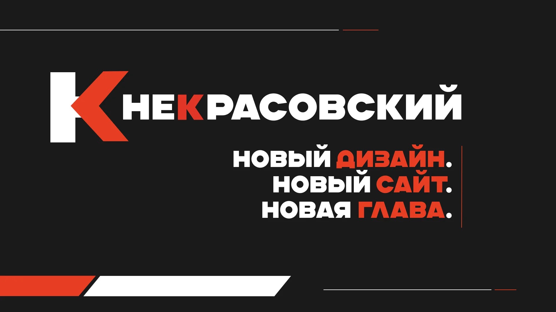
We are launching a new chapter in the history of our holding — with an updated visual language and a completely redesigned digital space.
The new design reflects our evolution: from a small production facility to a modern diversified full-cycle holding. Clean shapes, a refined color palette, and thoughtful typography — all of this creates the image of a reliable partner looking toward the future.
What has changed
New Corporate Identity
Updated logo and visual system. We preserved recognizability while adding modernity. Every design element works to shape the perception of the holding as a technology-driven and open company.
Unified styling for all touchpoints. From business cards and presentations to product packaging and digital interfaces — one language, one story.
New Website nekras.ru
Completely restructured design and layout. The site is now faster, more user-friendly, and more informative.
Key sections:
- Business Lines — typography, polymer extrusion, souvenir products, cosmetics and household goods, custom polymer casting. Everything organized with descriptions and figures.
- About the Company — who we are, where we came from, where we are headed. Mission, values, key projects.
- For Investors — current opportunities, contacts.
- Contacts — feedback form, addresses, phone numbers for sales, procurement, and investment departments.
Why we did this
The market is changing. Client, investor, and partner expectations are growing. We want every interaction with the holding — from the first visit to the website to shipment of a batch — to be comfortable, transparent, and predictable.
The new design and new website are not just a beautiful wrapper. They are tools that help us:
- Communicate information about products and services faster
- Simplify communication with investors and customers
- Build trust through data openness
- Save time for clients and partners
Nekrasovsky Holding — the future is our profession. Now in a new design.